Role
Researcher
Designer
Evaluator
Editor
Presenter
Designer
Evaluator
Editor
Presenter
Timeline
9 Weeks
Client
n/a
Team
3 UX Consultants
Type
Academic

Vox is a prominent media outlet that takes pride in their work of making this complex world a little easier to understand. This project was aimed to enable and streamline their goal. Our team audited their current web interface for design elements and accessibility. We then interpreted Vox's brand values and crafted design principles for TBH (To Be Honest), a design system for Vox's website. We created a custom UI kit in Figma, a detailed documentation website in Zeroheight and finally pitched our design system to a group of hypothetical stakeholders.
We began by asking ourselves: What are the values that Vox stands by? and How can a design system help them in maintaining or even enhancing these values? The brand values and commitments that stood out were:
Transparency builds trust. They acknowledge existence of biases and work hard to be fair and empathetic to all perspectives.

Information should be accessed by everyone. When more people understand why something is happening, we’re all better off.

Identity-related topics touch every part of our culture and society, and should be addressed as such.
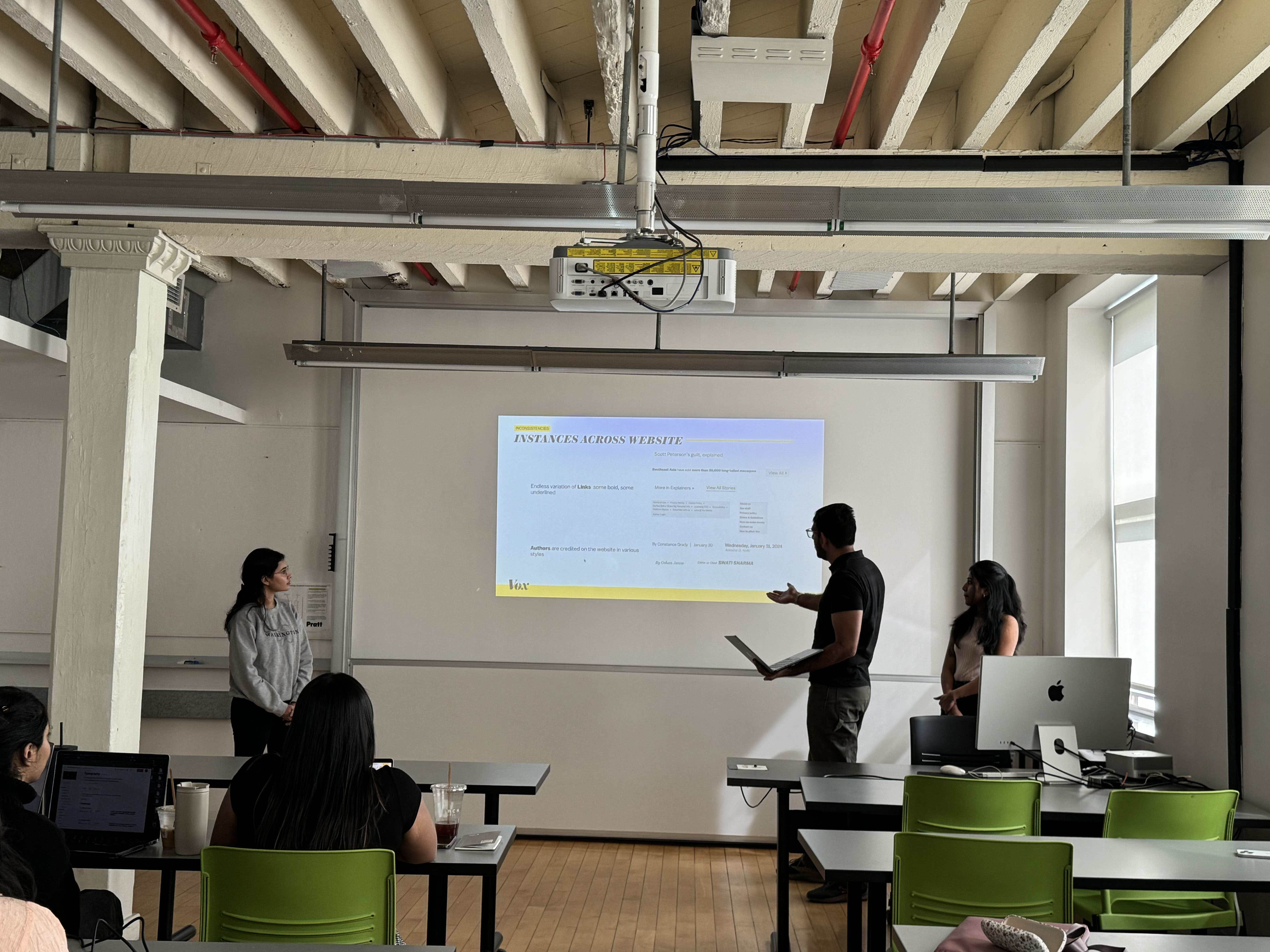
We discovered a few issues present across their website in its current form that inhibits Vox from achieving their commitments. Key factors amongst these are:
These issues can be addressed and alleviated with the implementation of a design system, that would provide unified and reliable guidance.
Our process for creation of TBH Design System for Vox followed a 4-step approach.
Auditing and evaluating the Interface inventory.
Interpreting brand values and defining design principles
Creating a Figma UI Kit and publishing on Figma Community
Documenting the design system's principles, guidelines and, elements.
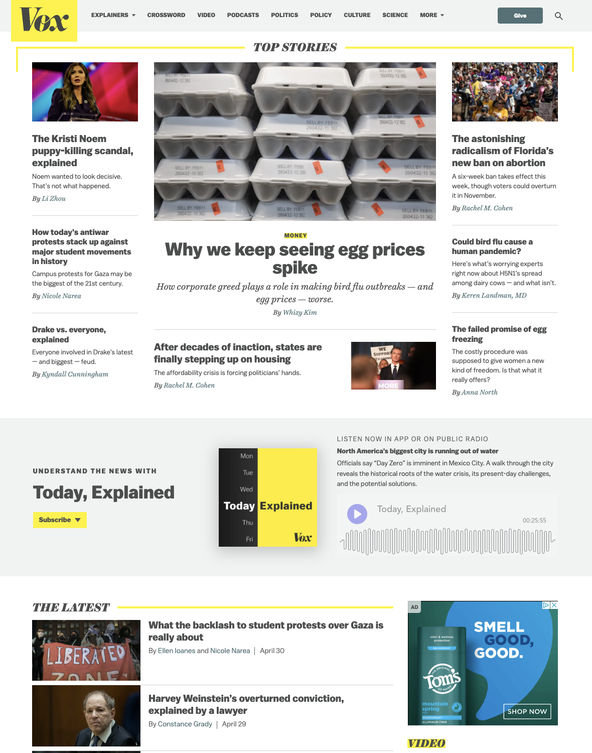
Taking cues from Interface Inventory by Brad Frost, an exhaustive inventory was created. We took screenshots of elements in all visible styles present on Vox's website and created a Figma design board. We then categorized them into: colors, typography, navigation, buttons, icons, cards, interactive elements, blocks, and more.
After categorization, our team went over the elements and components in this inventory, looking for instances of inconsistencies, conflicting elements, etc. We also evaluated the elements for accessibility using the WCAG guidelines.
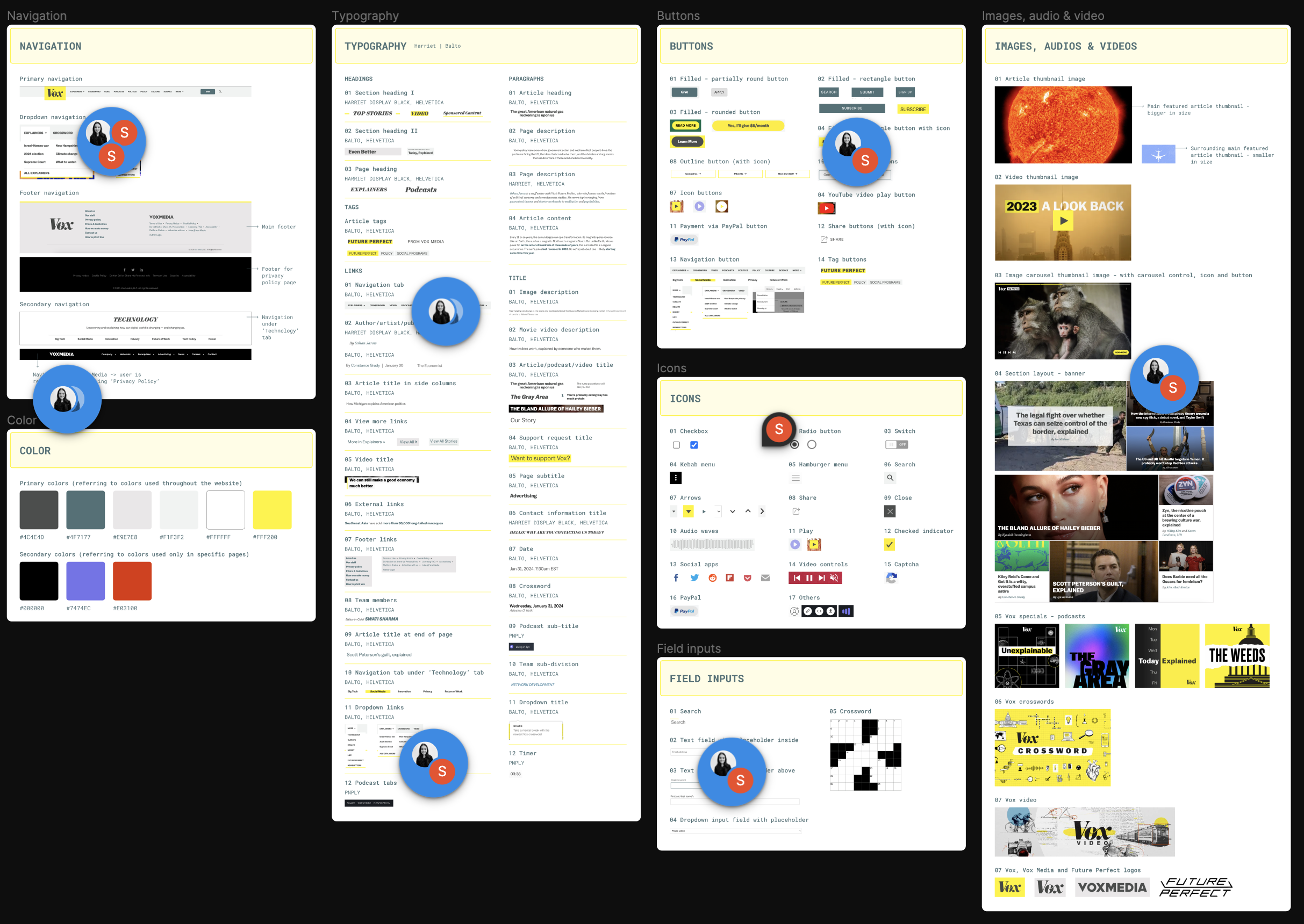
Snippet from the Interface Inventory created to evaluate styles and accessibility
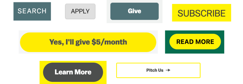
There were at least 8 styles of call to action buttons. 12 styles for links, 12 styles for titles, 4 styles for paragraphs, 3 styles for headings, etc for a total of 34 typographic styles and 15 color swatches.
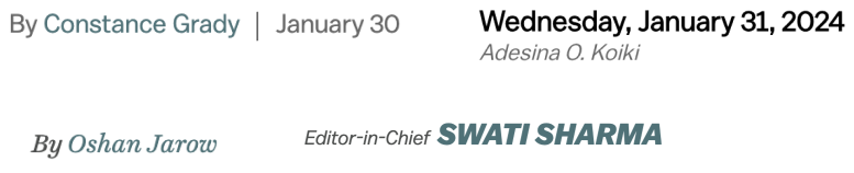
We identified 4 distinct styles for byline. This creates an hierarchy that is unintentional, Among these styles all of them had a different font style.
While most of the elements on the website were accessible some elements do not pass color contrast standards set by WCAG. Other than color contrast, a few elements had missing focus states.

Inconsistencies disrupt the flow of user interaction, leading to confusion and increased cognitive load.
Users struggle to navigate interfaces, affecting task completion rates and overall satisfaction.
Repeated poor user experiences can affect brand reputation and discourage repeat usage.
In order to address the issues and problems with the current website, we had to redesign some elements and create some new ones. But, before we did that we needed to define design principles for our design system that were grounded and were in alignment with values of both Vox and Our team. We brainstormed many ideals and then decided on these 3 Principles:

Unapologetically distinct
Fearlessly creative

User-centric
Clarity through simplicity
Precision

Embrace diversity
Empowerment through
accessibility
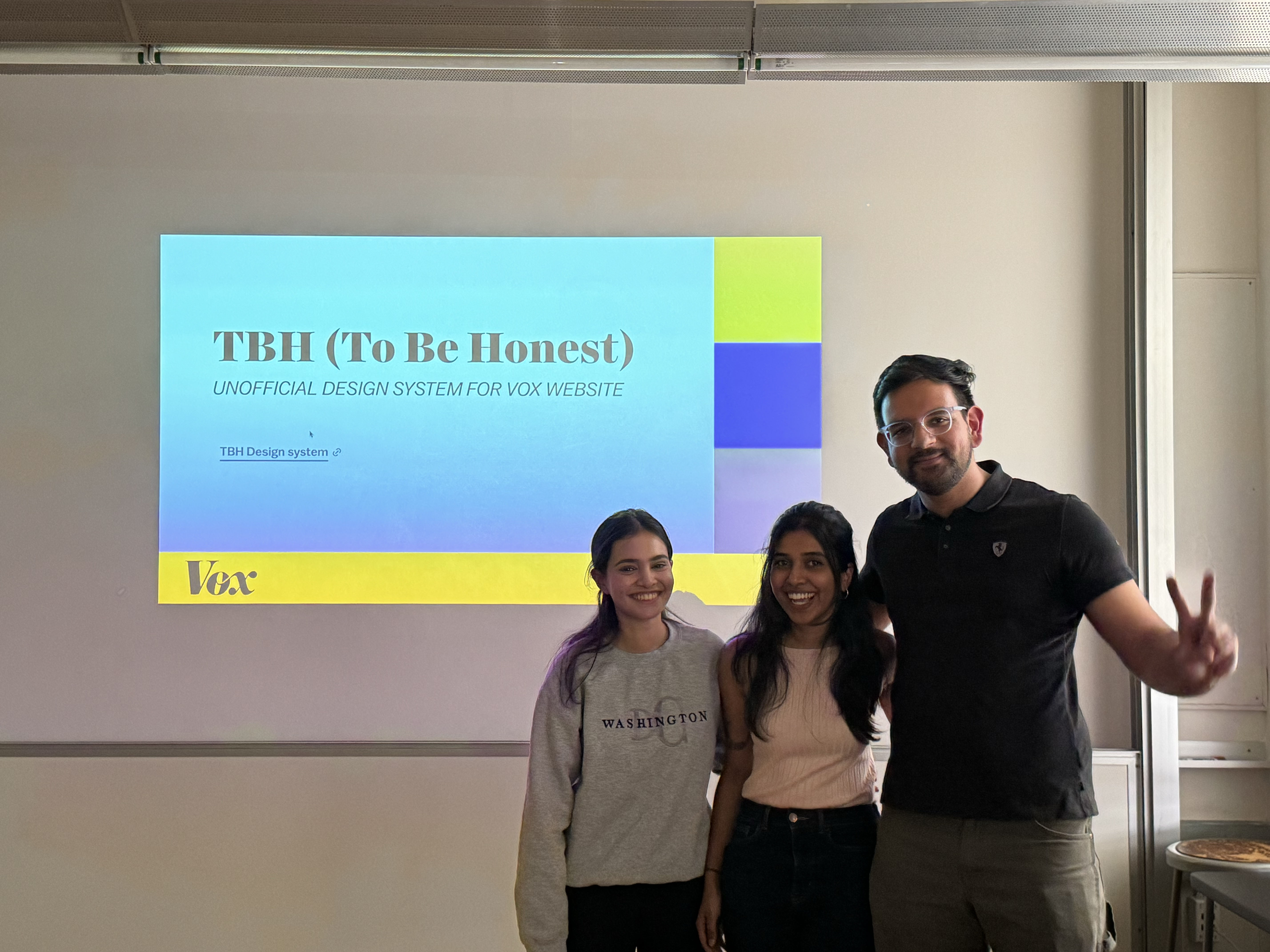
The name TBH: To Be Honest reflects Vox's values and commitment to transparency, accessibility and unique identity. It exudes unbiased and fearless character that is neither tame nor limited.
We spent a lot of time discussing and making sense of how tokenization works, is it even required? At the end of that work session, we were able to decide on using a selective 3 tier token system for color, that was simple enough and provided us with the required flexibility.

The TBH Team trying their best to make sense of tokenization of color
We created a total of 16 distinct typographic styles. Some of these styles included size variants to better suit various viewports sizes.
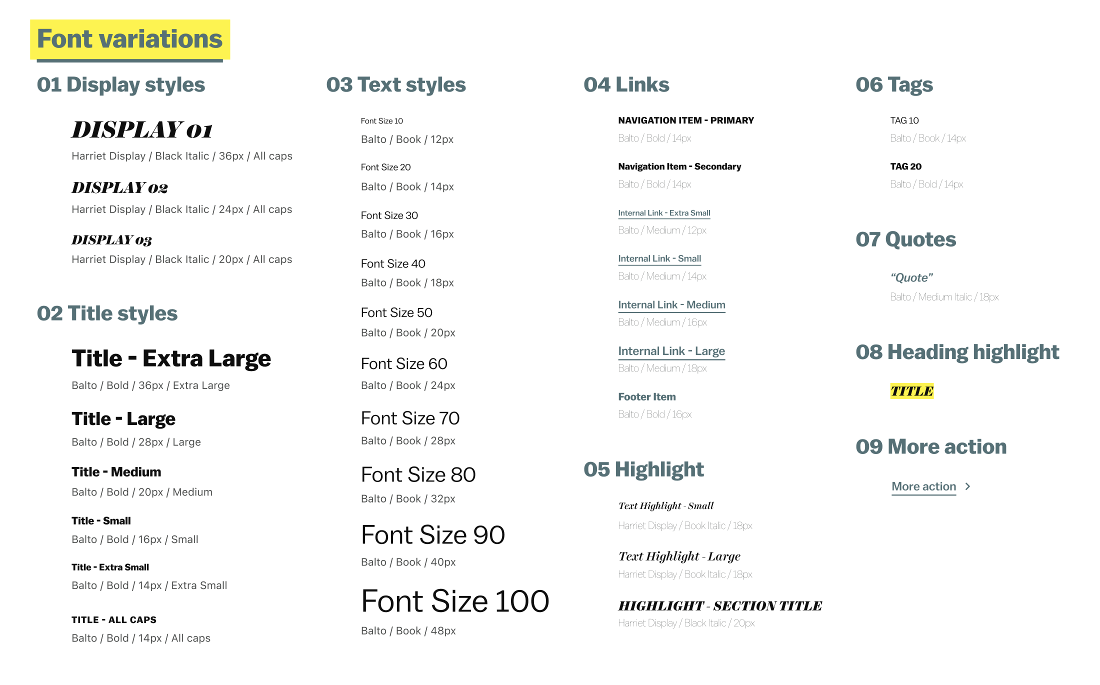
Font Styles


Accessibility color matrix was developed to better inform the users of TBH about what color combinations were safe to use. (A minimum of 4.5:1 contrast ratio for WCAG AA Rating) Throughout the system we've tried to prioritize combinations that pass the more stringent WCAG AAA Rating (contrast ratio between background and foreground of 7:1).
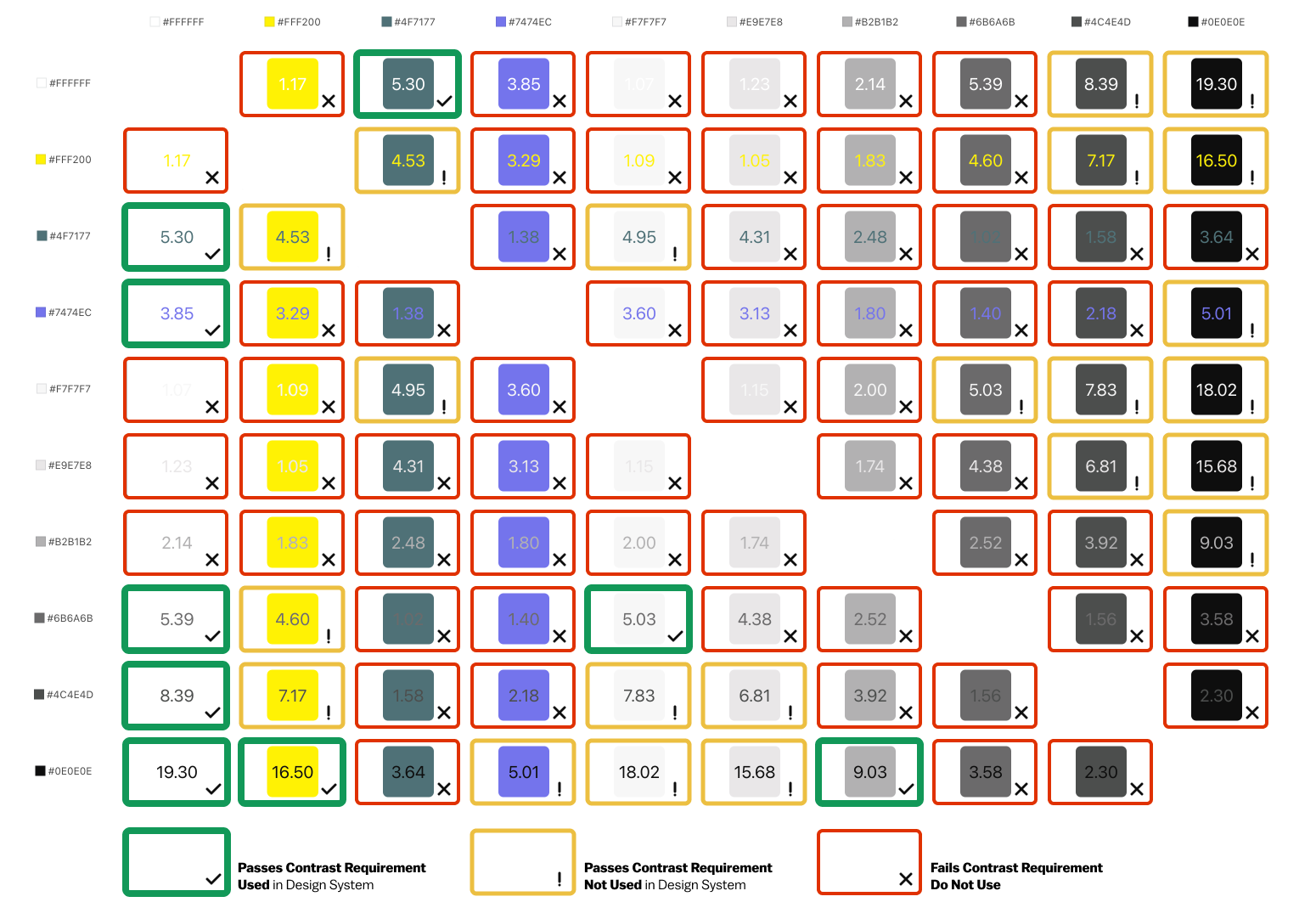
Accessibility color matrix for TBH
Content should be accessed by everyone using any screen size, to reinforce the principle of inclusion we included breakpoints to our design system from the get-go.
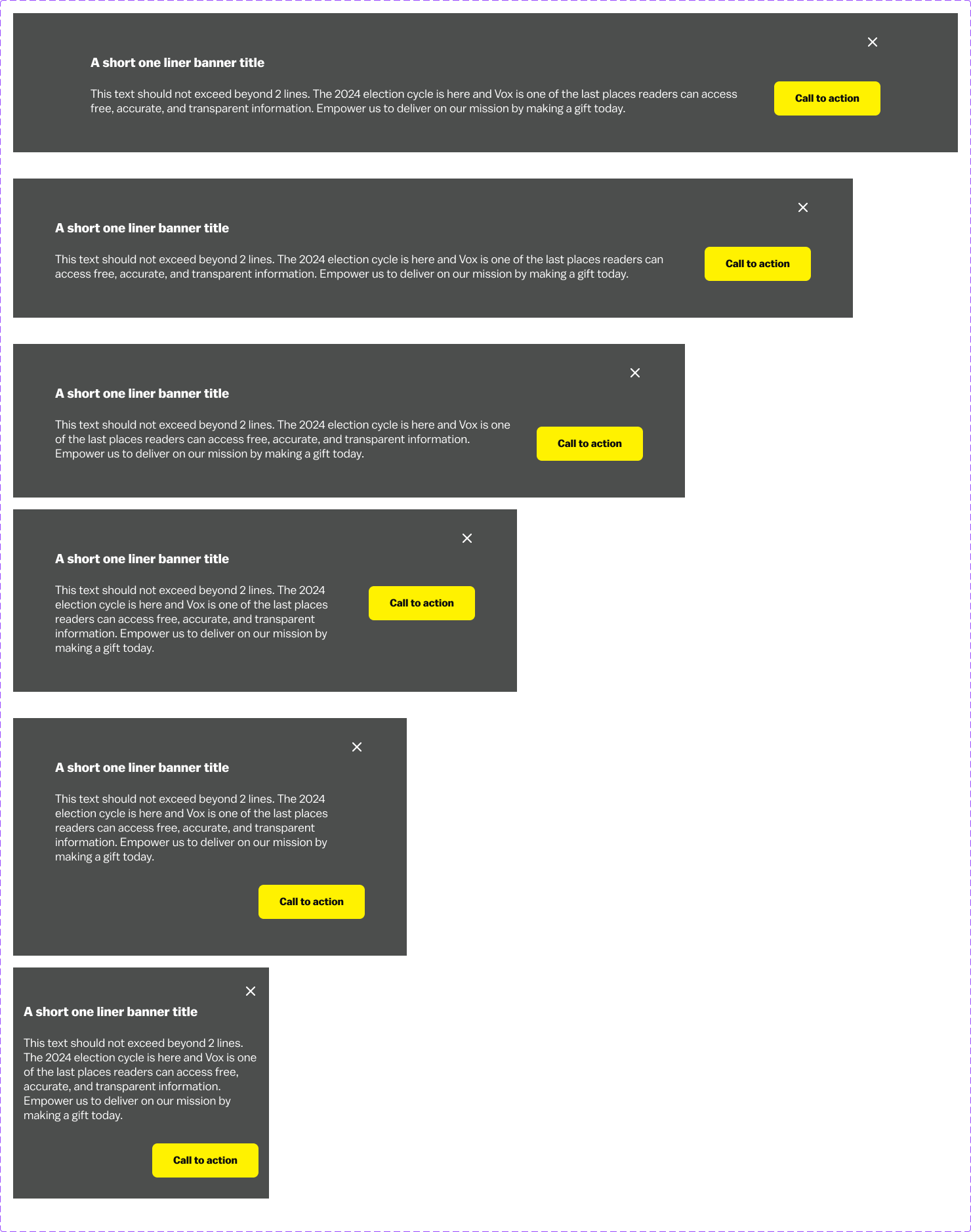
Different break points available for banner element in TBH
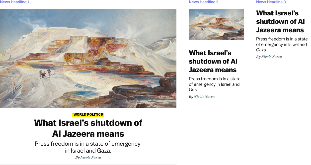
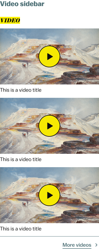
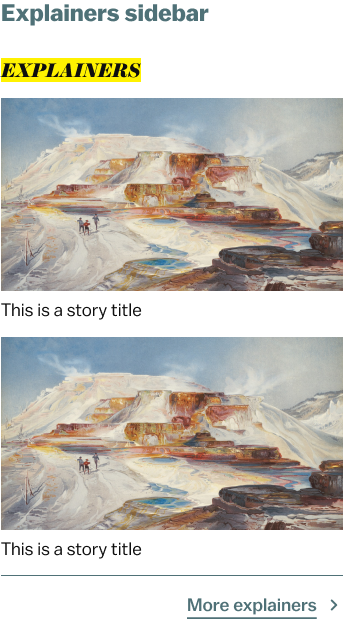
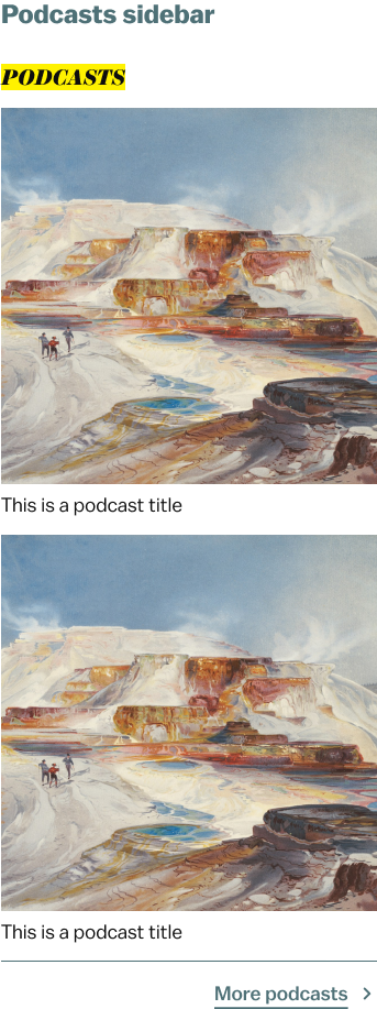
Card components for top stories section
We utilized advanced features like Variants, Variables and Auto-Layout in Figma to include states and responsiveness to our design elements.
Sidebar components with multiple variants
We utilized the new and advanced features in Figma to create single component item that had multiple variants to suit the specific need of the use case.
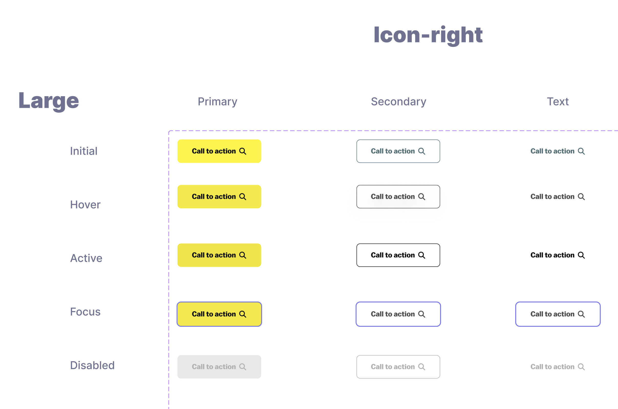
1 Button component 75 possible variations
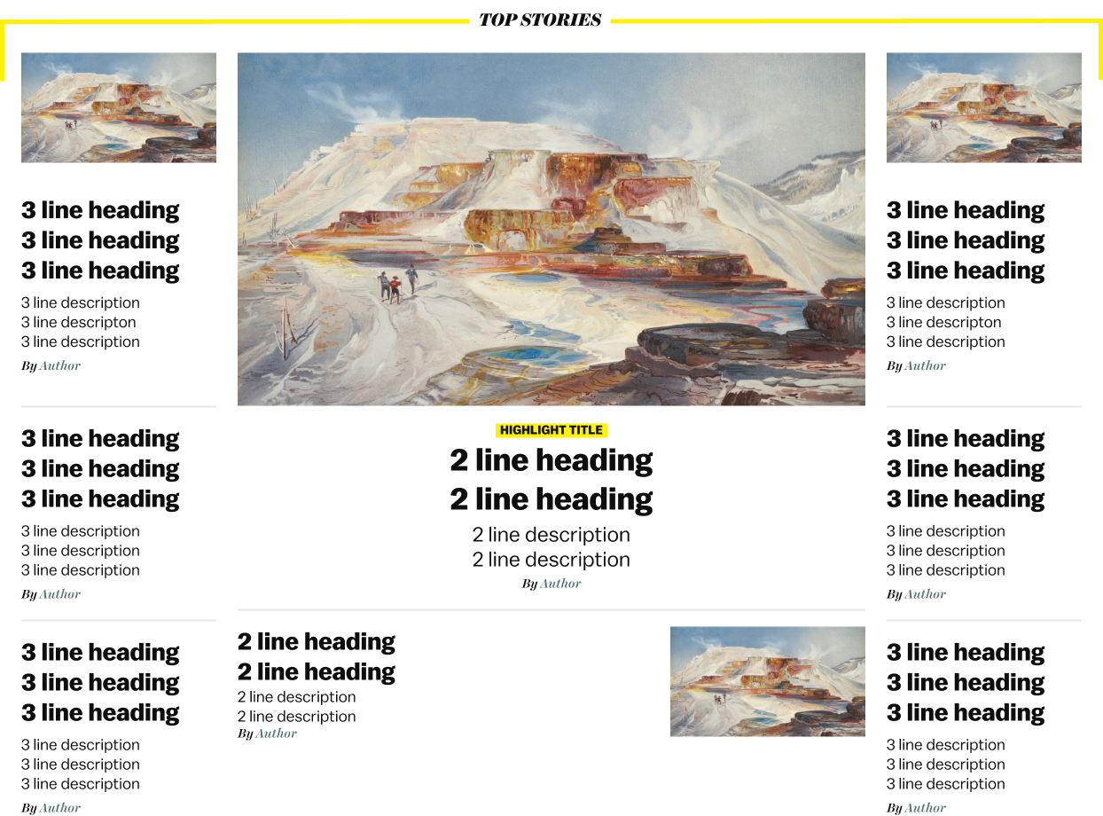
Design Pattern for Top stories section
We conducted usability testing sessions, where our subjects were asked to recreate the Vox homepage using TBH UI Kit. The subjects couldn't search for certain element from the assets panel, but they were able to locate the required component by browsing the UI Kit. The test subjects expressed that they use a different term for the element. Some of the elements had missing variants. These insights were then used to rename elements and add the missing variants to the UI kit.
The TBH UI Kit is available on Figma Community page. We have published a few updates since the first UI Kit, incorporating feedback from User Testing and adding additional design elements.
We created the documentation for TBH on the Zeroheight Platform. As Zeroheight is purpose made to host documentation websites for design systems, the process of importing our elements and components from figma and begin documentation was streamlined and easy.
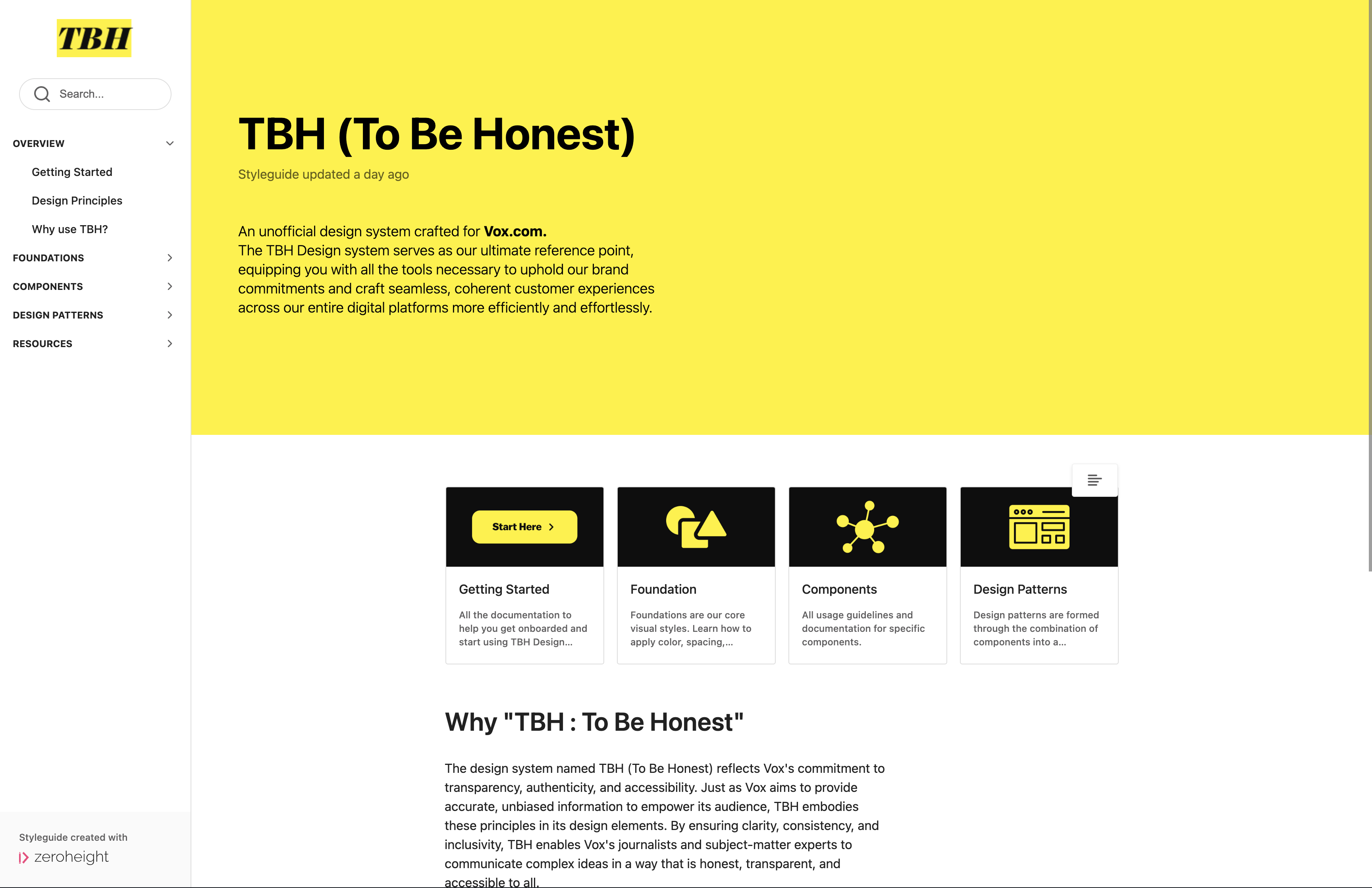
Landing Page of the documentation website for TBH
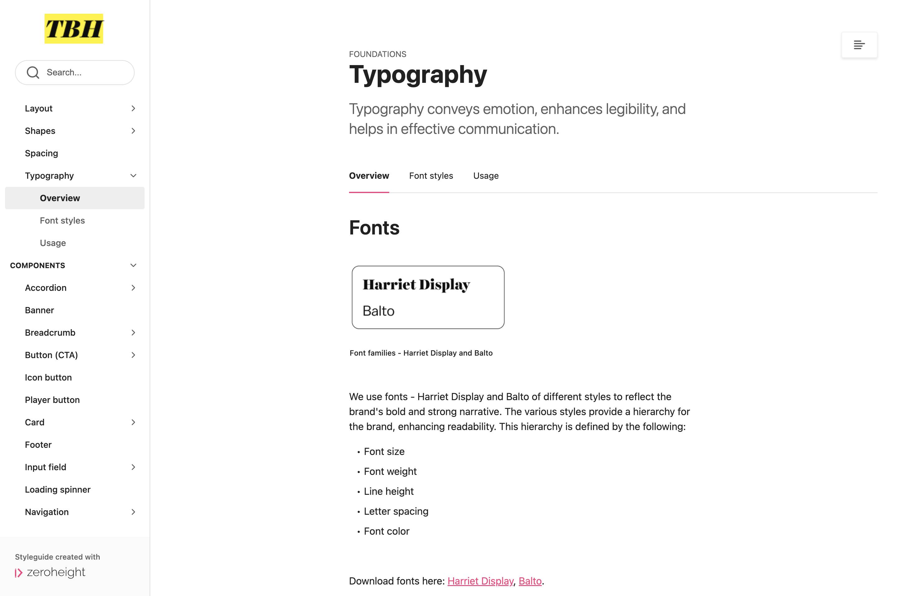
Typography page showcasing overview, styles, and usage
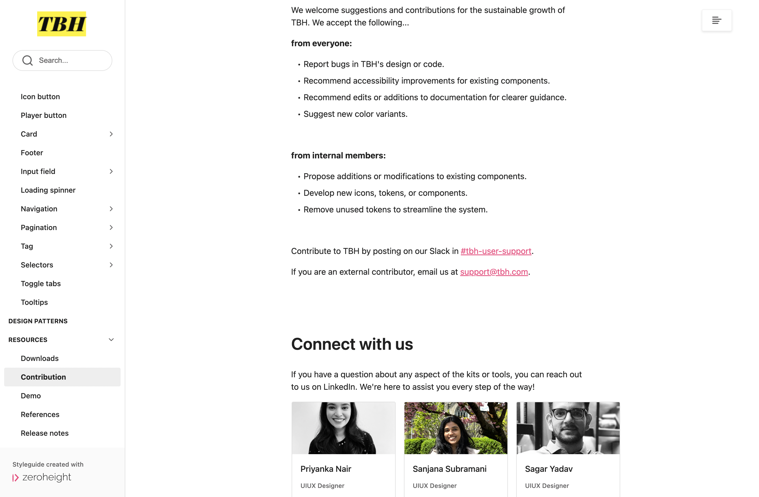
Contribution page with socialization possibilities.
The documentation took most time as it required description of all elements (from foundational to more advanced design patterns), their usage and accessibility guidelines. The creation of TBH Design System was now complete. We just needed to do one more thing.
The pitch deck included highlights about key components of our design system, and our reasoning behind them. How using TBH would benefit users, designers, and the company.
We covered the following in our pitch deck:
Our pitch for TBH was well-received by the audience (peers and professor). The structure to our pitch deck was appreciated. The branding and design principles were said to be fully aligned with Vox.
Pitching TBH Design System to our peers and professor
Team TBH: Priyanka Nair, Sanjana Subramani, Sagar Yadav (Me)
TBH has limited support for developers, we've defined and enabled variants and variables in our components. We acknowledge it is not comprehensive and would like to expand our design system to include code.
Design systems are more than UI kits. Brand values, design principles, accessibility, documentation and governance are distilled to create a comprehensive and sustainable design system.
Working on TBH, I gained a better understanding of Figma's new and advanced features.
I evolved as a team member, clear communication and support goes a long way in collaboration with people having a variety of skills.
